
/ 00-
1
/
← BACK
CLIENT
WELLCERTIFIED.COM
YEARS
2018 - 2025
BACKGROUND
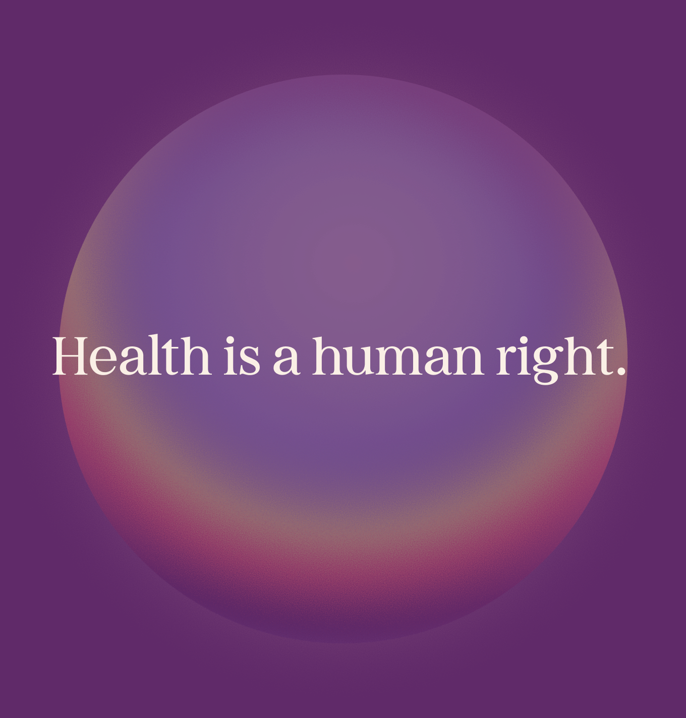
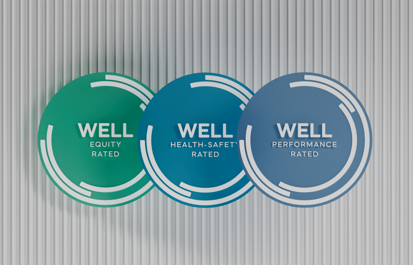
WELL is a healthy building certification program. The system focuses on creating spaces that enhance physical, mental, and social health, suitable for various sectors including office, residential, retail, and hospitality.
In 2017 WELL was still emerging, with a relatively small global base of certified professionals (WELL APs) and registered projects. I worked with them to lend further legitimacy to their product, helping them go from a niche certification to a global standard.
Over the course of an 8 year partnership, I became a go-to designer for the WELL marketing team, assisting in: product landing pages, keynote events, pitch decks, e-mails, social assets, documentation, forums, educational resources and more. I strived to put people at the heart of my work, while at the same time introducing visual qualities to help set WELL apart from their peers in the industry.
SERVICES
ILLUSTRATION
WEB DESIGN
PRINT DESIGN
USER INTERFACE
DATA VISUALIZATION
3-D DESIGN
MOTION DESIGN
CONTENT STRATEGY
200+
ILLUSTRATIONS, MOTION DESIGNS
AND GRAPHIC ASSETS

250+
WEB PAGES, SOCIAL ASSETS,
AND MARKETING MATERIALS
FULL-SCALE
UI AND DESIGN LIBRARIES
SERVICES
ILLUSTRATION
WEB DESIGN
PRINT DESIGN
USER INTERFACE
DATA VISUALIZATION
3-D DESIGN
MOTION DESIGN
CONTENT STRATEGY
APPROACH
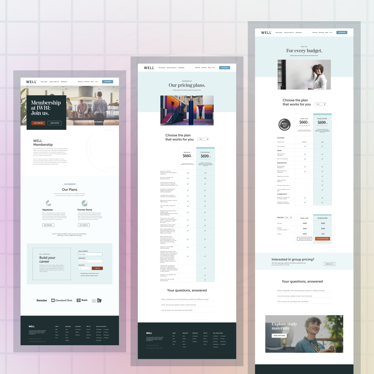
The aim of WELL Certification is focused on improving people's lives, but when I first came onboard their marketing materials and design system weren't visually reflecting enough of that intent. The design language was limited in its scope, lacking in color styles and UI components to map to their needs.
The marketing page designs relied mostly on plain stock imagery, had inconsistent page flows, and the sections were overly-populated with information. Page data demonstrated low user-retention and was failing to convert new leads.
Design goals:
- Identify the most important page sections and make more visually prominent.
- Integrate CTA's and Benefit sections more naturally into the layouts.
- Create stronger visual accompaniments to reflect the materials better.
- New design system with retooled colors, fonts, UI, and spacing system.
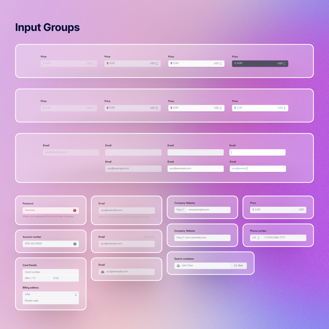
UI + DESIGN SYSTEM
I worked on two major brand refreshes for WELL, the first in 2018, and the second in 2023. Additionally, I took part in many new initiatives where I expanded on the base design system, making sure that each product launch would feel fresh, while maintaining cohesion with the wider body of work.
For all of these efforts my strategy was focused on creating a visual identity which better reflected their approach to health-centered certification, resulting in a more polished and vibrant brand, one more closely aligned to their overall messaging.
BRAND REFRESH NO. 1
The first brand update, which began in 2018, was all about elevating the foundational pieces. One of my main goals was to allow the pages more room to breathe, with less reliance on walled-off content sections. There were also small inconsistencies throughout that needed updating, for things like icon sets, buttons, and form styles.


To begin rectifying all of the issues I put together a new design system with updated spacing standards, font styles, and UI components.
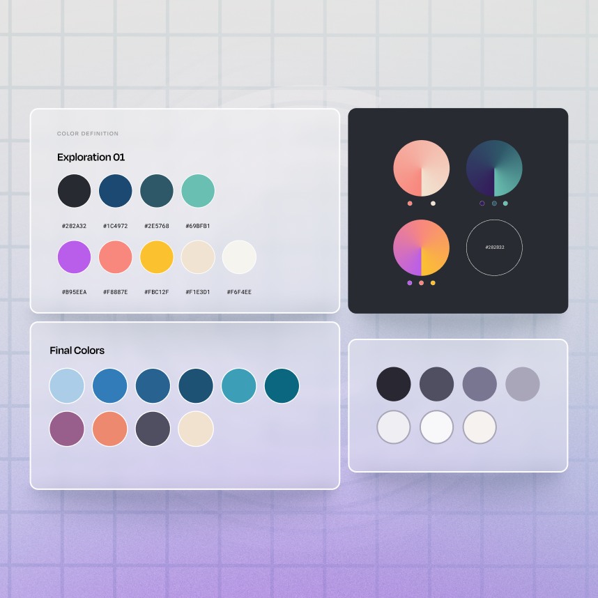
I touched up the colors by adding more earth-tones to bolster the primary palette, and introduced a new tertiary set of colors for use with things like CTA's, button states, alerts, and call-outs.
The result was cleaner page designs with content sections that were far easier to digest. With the refreshed design system we were able to help reduce turnaround times on new pages by 35%.
BRAND REFRESH NO. 2
By 2023, WELL had firmly cemented itself as a global leader in building certification. To accommodate their rapid growth the brand began to expand its offerings. With that came a need for another update to our design system.


I took this opportunity to further improve our design system by creating UI components with better defined states, resulting in a more polished appearance and a better overall user experience.
We built out a revamped color palette, with a wider spectrum of options to choose from.
Additionally, new font pairings and and a refined spacing system were introduced as well.
This update helped new product offerings stand out and actually feel new. Pre-existing pages were also given refreshed treatments, resulting in a bolder brand identity.

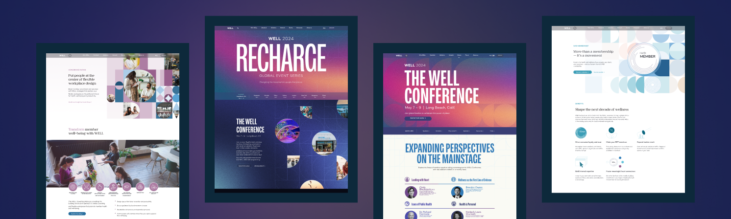
VISUAL STRATEGIES
When I had first joined up, the landing pages and marketing assets were overly reliant on stock imagery for the visuals.
Many of their peers had taken a similar approach with their digital materials, opting for a more safe and austere presentation. I wanted to help WELL stand out from their competition.
They were a wonderful client to work with because they valued good design above any preconceived ideas of what the marketing materials should look like for someone in their industry. I was able to think outside of the industry norms and present them with unexpected visual approaches that would help modernize their brand.
ILLUSTRATED TREATMENTS
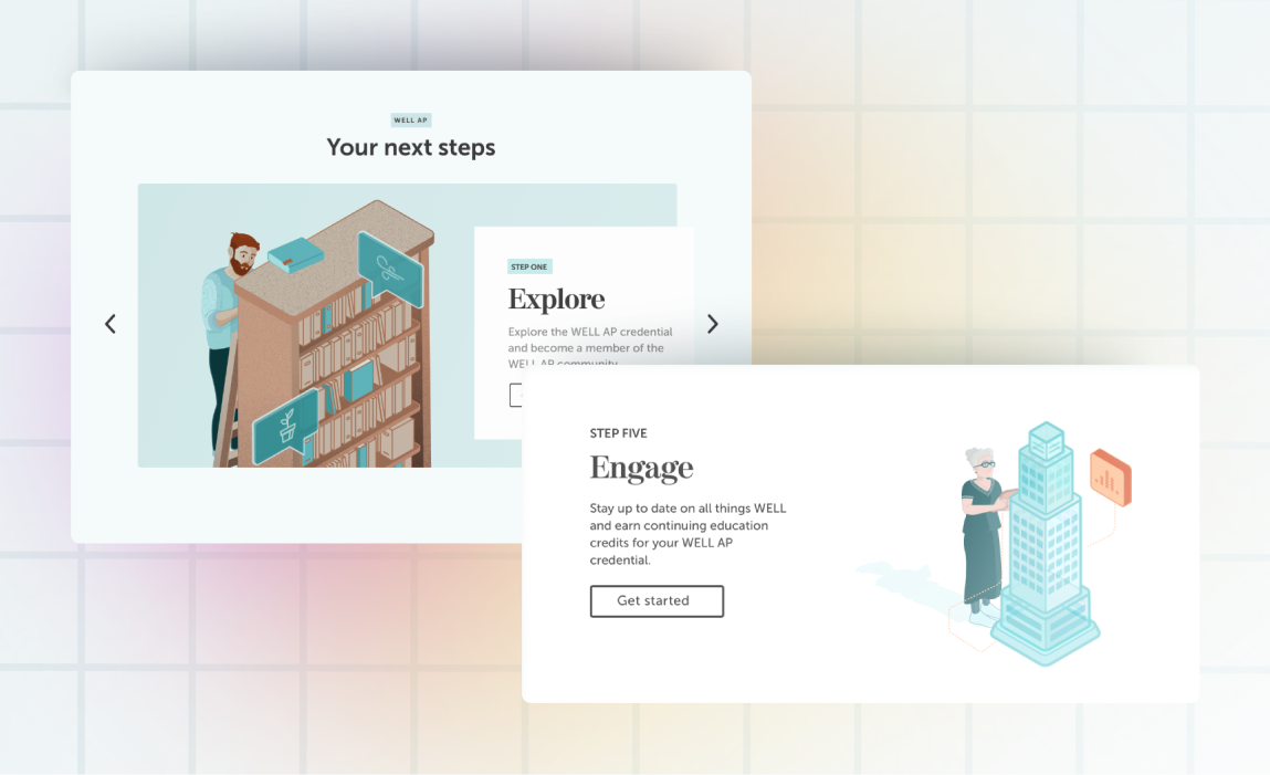
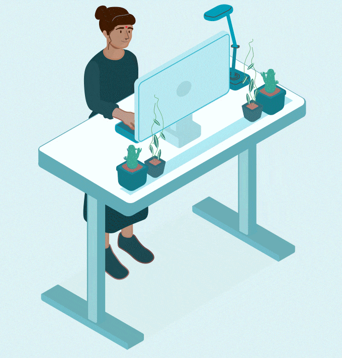
It was clear that the pages needed imagery with less visual weight than the stock photography they were using for all of their visual accompaniments. As a solution I created custom illustrations, with the aim being to make the pages feel lighter, while also being content-specific and complimentary to the text they would be paired with.
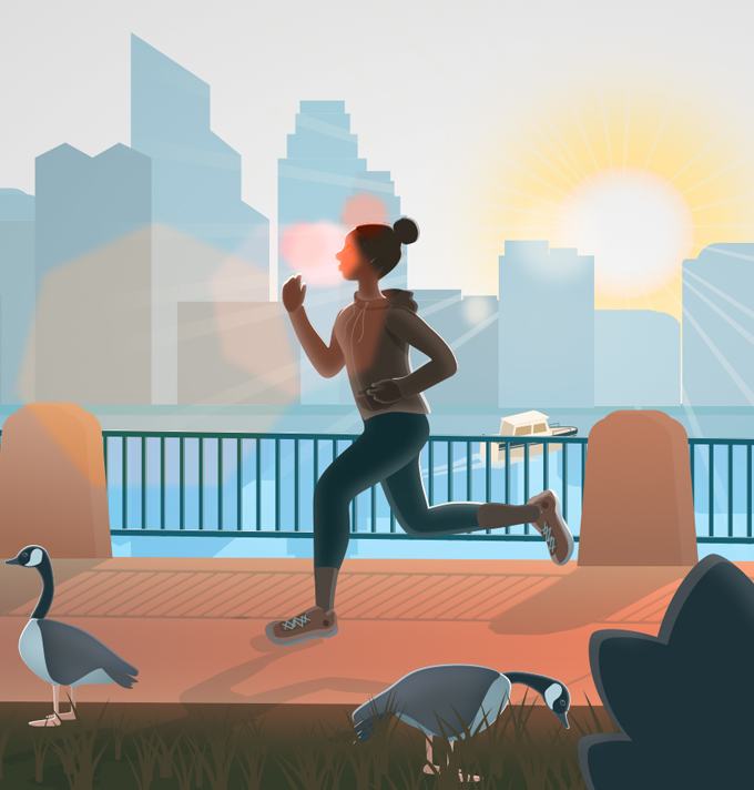


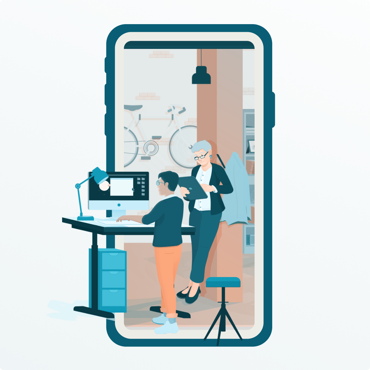
A long-running problem for WELL was trying to find ways to explain their process and the product itself in a more engaging and understandable way. I helped add life to these sections by creating an illustrated series to accompany the process steps.
Error and warning pages were a really fun opportunity to for me to be a little more playful with the illustrations. At the same time I wanted them to reflect an idea from the overall messaging, showing people who were engaging in healthy activities, albeit, ones that didn't always go according to plan.
With WELL being a global product, meant to help everyone, I felt it was important that the characters in all of my illustrations were very inclusive, meant to reflect the wide diversity of people across the globe who could benefit from their services.
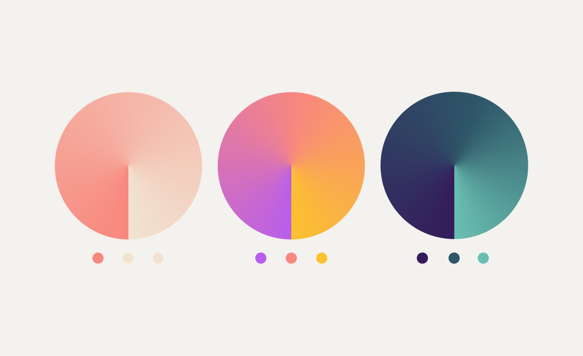
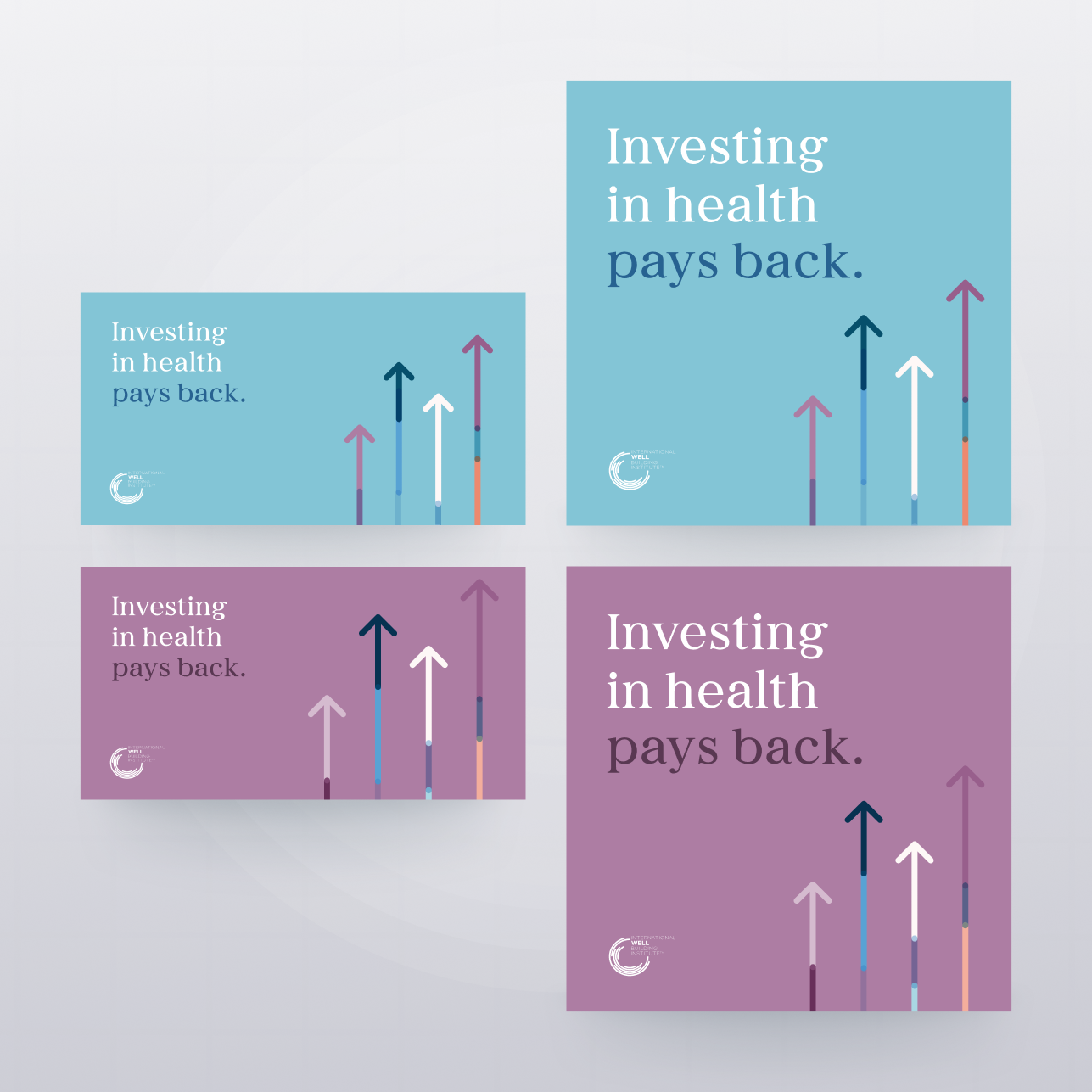
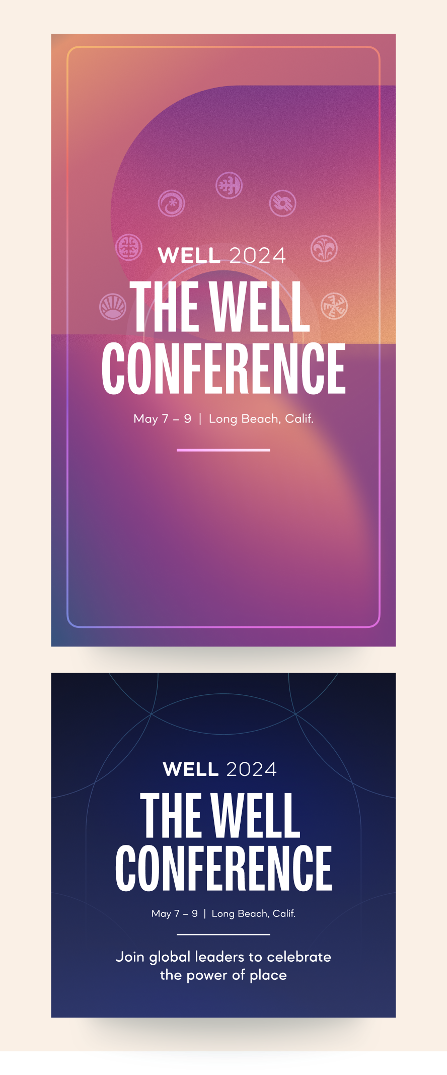
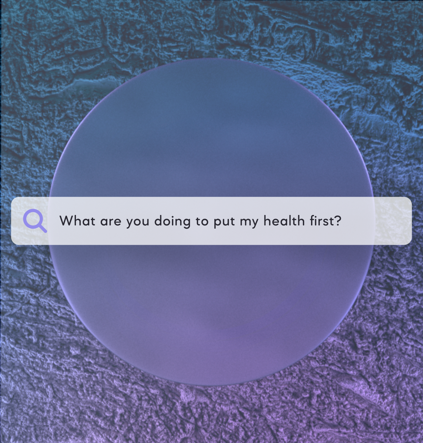
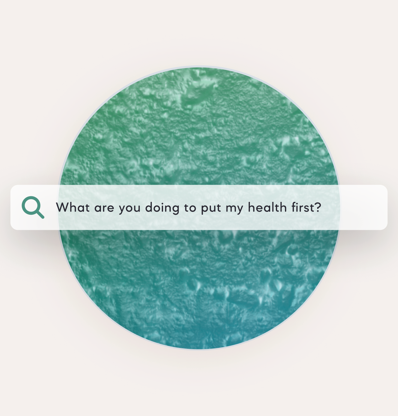
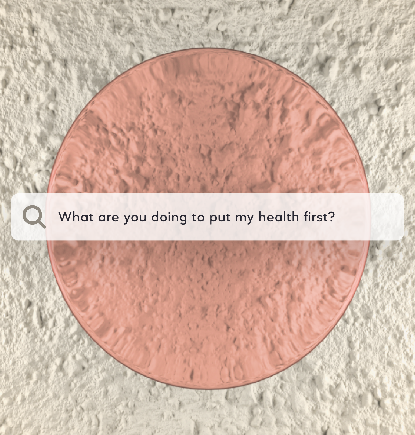
COLOR, SHAPE, AND TEXTURE
During our brand refresh in 2023, we played with adding more textural imagery into the mix, and took a more geometric approach toward the graphic elements. We also explored a more vivid color palette, allowing us to take bolder approaches to the designs. Along with this we also introduced gradients, which I tried to make feel elegant, natural, and complimentary to the text and graphic placements on the page. This approach was further expanded upon with subsequent page designs.


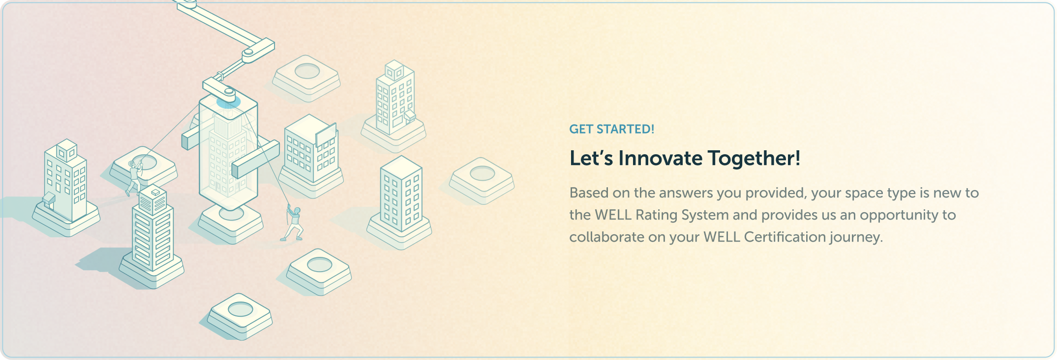
3-DIMENSIONAL VISUAL TREATMENTS
I added extra dimension to topographic, graphic elements and textural imagery by using displacement maps in Cinema 4D, then rendering out with Redshift. With this approach I was also able to add light rigs and tweak camera settings to give me added control, which I think helped to create really striking and dramatic imagery.


MOTION DESIGN
I introduced micro-animations alongside the third series of character illustrations that I worked on. They were subtle and used mainly to add a little more visual pizzazz to help draw the eye toward important page sections like Benefit sections or CTA's.
In 2023, with the updated design system refined and ready to go, I took the inniative while working on landing page layouts to start incorporating motion into the overall page, thinking more about user interactions and the like. This was a great opportunity to take advantage of my relationship with our talented dev team and integrate my motion designs into the code itself, using GSAP And Three.js.
To ensure that things weren't lost in handoff or left to guessing I created a comprehensive motion guide, detailing all of the ease settings, durations, motion curves, and specific animation types. The guide served as a north star for both myself and the developers, while also speeding up turnaround times on these elements significantly.
APPROACHES
When it came to social and promotional assets it was usually a straight-forward process of exporting from After Effects as an MP4 or MOV file, but for my work on the landing pages I was always looking for ways to integrate animations, particularly vector-based ones, without losing fidelity. There’s always a constant struggle to keep file sizes low, but that usually comes at the cost of image degradation. A solution came along in the form of Lottie, allowing me to finally export high-quality animations while keeping them optimized for performance.
WEB-BASED ANIMATIONS
With the refreshed design system, in 2023, I saw an opportunity to work closer with Nick, a very talented developer we had recently added to the team at Function. He was familiar with programming for advanced web-based animations so I was eager to take advantage. We kept in constant contact to translate the motion designs, from the demos I had put together in After Effects, into code. There were a few bumpy moments at first, but we smoothed out the kinks and established a workflow that kept us on schedule and able to keep dreaming up page sections that really heightened the experience and made the page designs sing.
MOTION DESIGN GUIDE
To make sure that both myself and the dev team could stay on the same track I built out detailed motion guides featuring all of the specific information needed for the devs to replicate the motion designs perfectly with code.
.gif)

SERVICES
ILLUSTRATION
WEB DESIGN
PRINT DESIGN
USER INTERFACE
DATA VISUALIZATION
3-D DESIGN
MOTION DESIGN
CONTENT STRATEGY
outcome
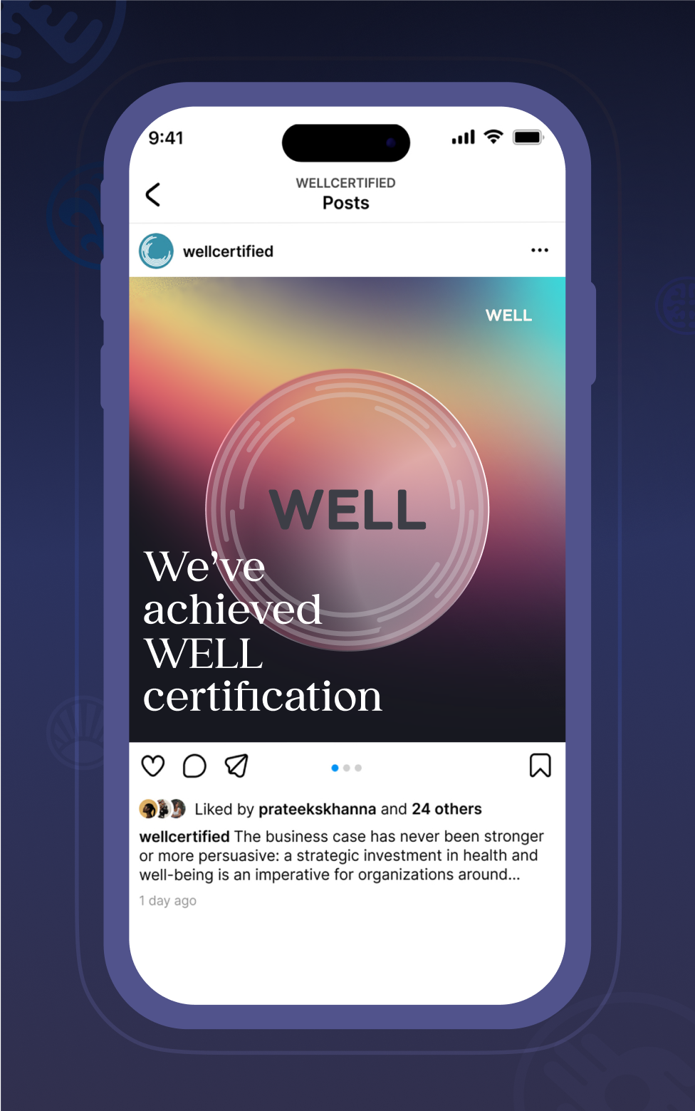
When I came onboard the brand were a niche product known to few outside of their industry. Today they are a globally recognized, celebrity-endorsed brand, which has continued to experience exponential growth.
The exact measure of my overall contribution to their rise in popularity is a hard thing to say in no uncertain terms, as I was just one piece of the puzzle, but I do believe that my many contributions toward reshaping WELL's visual identity helped them to grow their appeal and stand out among their peers.
RESULTS:
- WELL APs grew from a few thousand in 2017 to 30,000+ globally by the mid-2020s
- Lead capture boosted by 8%+.
- Registered projects: from hundreds to tens of thousands
- Engagement increased across the board, year-over-year, with users often mentioning a warmer and more human touch to the brand.
- The brand now receives a yearly average of 23 billion social media impressions.
WELL Online currently spans 131 countries and 300,000+ users.
